Client
Project
What we did
Opportunity
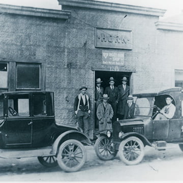
AC Horn has been manufacturing machines for the food industry for more than 100 years. Their brand – logo, identity, look and feel – and their website were all in need of an update that would appeal to modern buyers and still honor the company’s heritage. Company officials were divided on what the new brand image should look like.
Approach
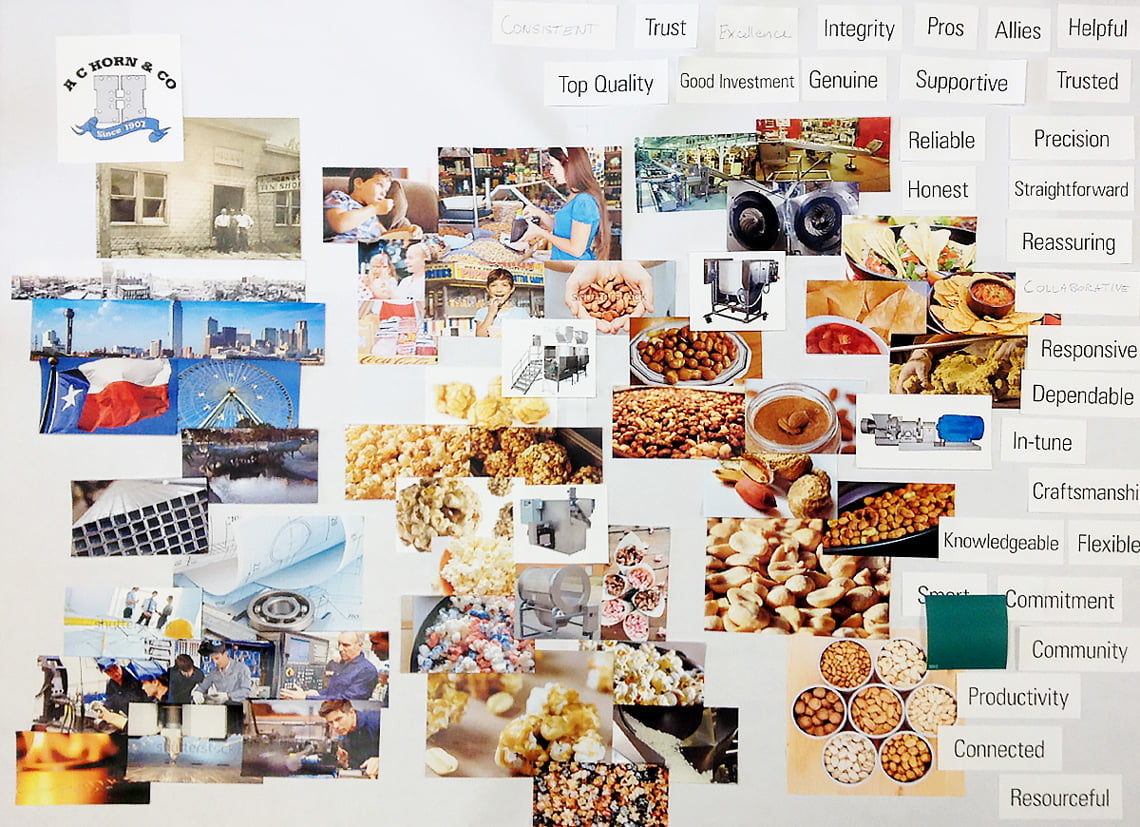
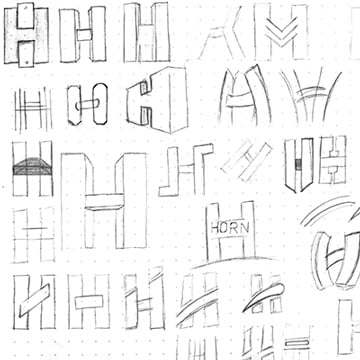
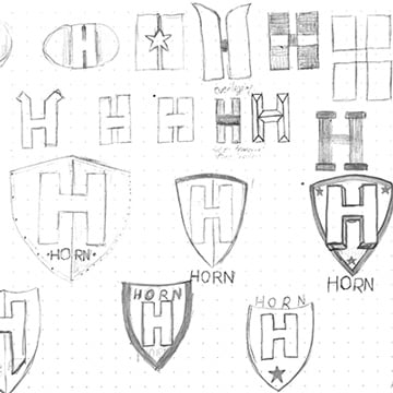
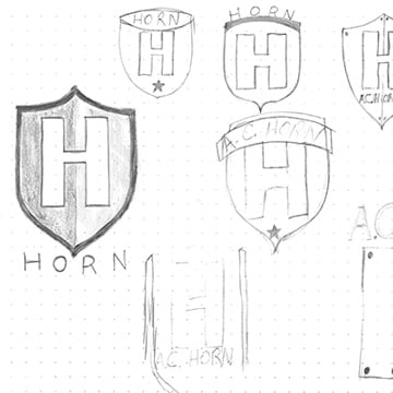
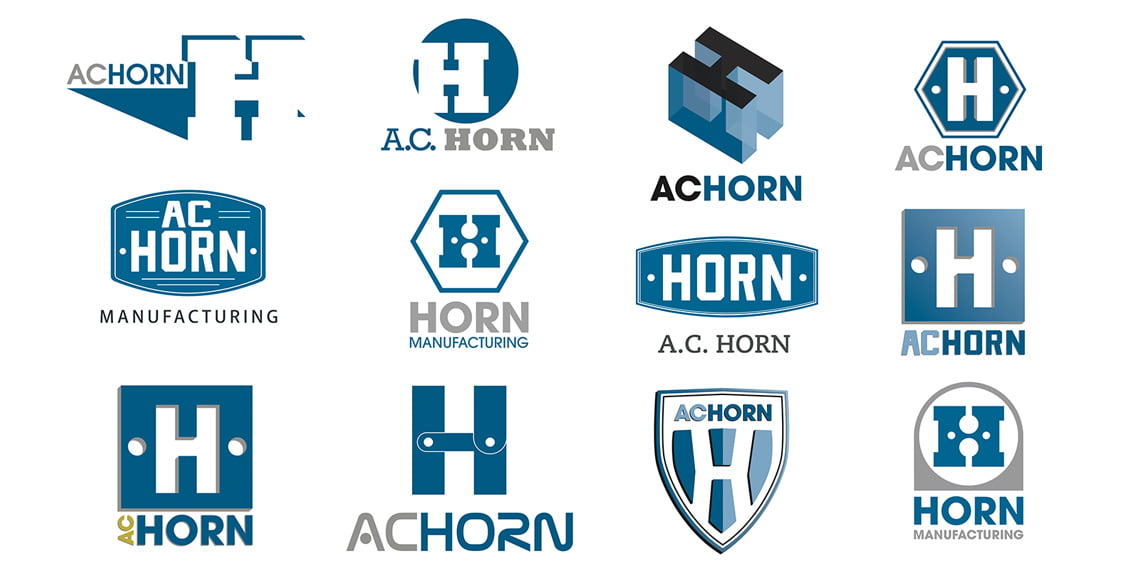
Through the use of mood boards that captured the company’s essence with textures, colors, look/feel, brand characteristics and photo styling, Quiet Light built a new visual roadmap that better reflects the company’s future trajectory and modern vision. Part of that visual roadmap was the new logo, which emulated a retro design, but with a modern and fresh twist.
How it Worked
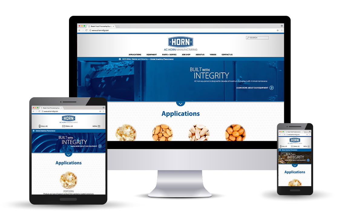
The new look and feel of the brand better represents AC Horn’s future vision, and the creative process, led by Quiet Light, enabled company factions to align around a shared brand identity. QLC also rebranded and reworked the company’s website. We improved SEO, reprogrammed functionality and, in coordination with an enhanced digital ad campaign, increased website traffic by 42 percent between 2015 and 2017, and raised conversions by 68 percent.
Quiet Light’s strategic and creative expertise helped us to evolve our brand in a way that kept true to our heritage yet is modern and strong. They are responsive, thoughtful and expertly guided us throughout the entire process.


